CASE STUDY 2: Air Logistics Portal Redesign
Role: UI Designer · Client: Federal Logistics Agency · Platform: Internal Web Application · Timeline: OngoingI redesigned the landing experience and navigation system for an air logistics reporting portal, replacing a cluttered legacy menu structure with a modern sidebar navigation, hero introduction, and organized content hierarchy.
The Challenge
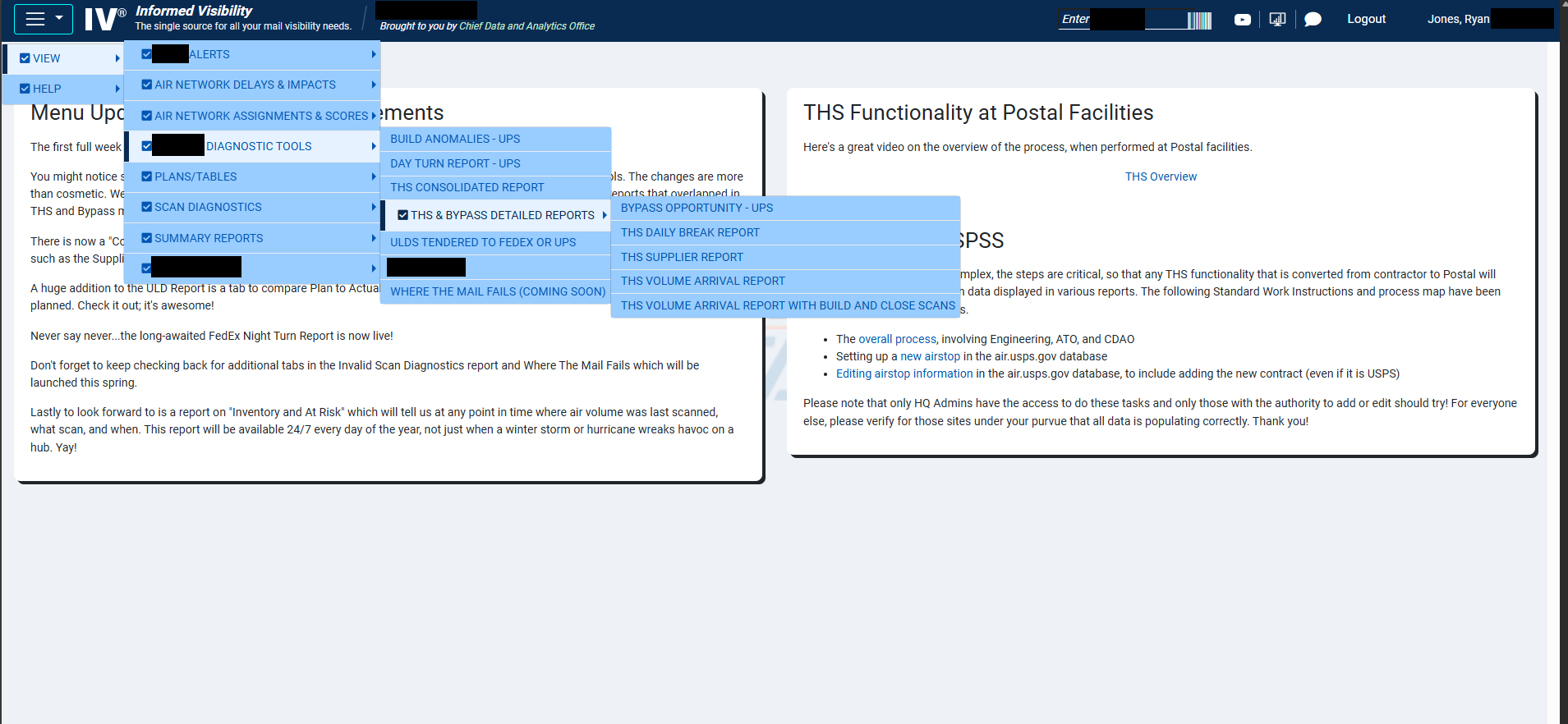
This portal served as the organizational hub for air logistics data — capacities, route information, contract details, and dozens of specialized reports. The tool had grown organically over many years, and its navigation reflected that history.
The primary navigation was a deeply nested checkbox-style mega menu with multiple fly-out levels. Finding a specific report meant hovering through three or four menu layers, each with long lists of items in small text. The landing page itself was a static text block with announcements — useful but doing nothing to help users orient themselves or find what they needed quickly.
The core problem wasn't missing functionality — everything was technically accessible. The problem was discoverability. Users with years of experience knew exactly where to click, but anyone newer to the system faced a steep learning curve. Even experienced users would lose their place in the nested menus.
Design Approach

I started by mapping the full menu structure to understand the scope — dozens of reports and tools organized across multiple categories. The first decision was structural: replace the nested fly-out pattern entirely with a persistent sidebar navigation that exposes the full hierarchy without requiring hover precision.
Beyond navigation, I saw an opportunity to redesign the landing experience. The original page was text-heavy with no visual entry point. I introduced a hero section that immediately communicates what the portal is, its current status, and key metadata — giving users context before they start navigating.
I also reorganized the announcement and quick-access areas into distinct card-based sections, creating a clear visual rhythm: orient (hero) → navigate (sidebar) → discover (content cards and announcements).
Throughout the process, I worked with the development team and incorporated feedback from both the technical staff and the director-level stakeholders who oversaw the platform.
The Solution
The redesigned portal introduces three key improvements:
Persistent sidebar navigation replaces the fly-out menus with an always-visible, expandable menu system. Categories expand in place with smooth transitions, and third-level items are accessible without hover timing issues. The sidebar also includes visual indicators for each section.
Hero section provides immediate context — the portal name, a brief description of its purpose, and live status indicators (system status, last updated date, and a key metric). This replaces the wall of announcement text that previously greeted users.
Structured content area organizes announcements, quick-access tools, and resources into clearly separated card-based sections with consistent formatting, replacing the single-column text layout.
I prototyped the full experience in HTML/CSS/JavaScript, including the sidebar expand/collapse interactions and responsive behavior, to give stakeholders a realistic preview before development.
Check out the live preview of this project here!
Collaboration & Outcome
This redesign was partly self-initiated — I identified the navigation issues through my own evaluation and pitched the concept to leadership. The idea was well-received, and I worked through iterations with feedback from directors and the development team. The persistent sidebar pattern, in particular, was recognized as a significant improvement for onboarding newer users who previously struggled with the nested menu system.