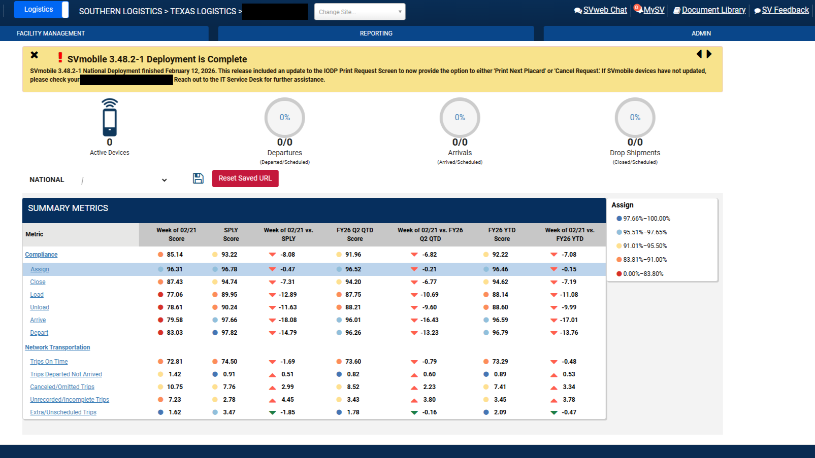
CASE STUDY 1: Operations Dashboard Redesign
Role: UI Designer · Client: Federal Logistics Agency · Platform: Internal Web Application · Timeline: OngoingI redesigned the primary operations dashboard for a nationwide federal logistics system, transforming a dense data table into a modern, card-based interface with embedded metrics, interactive charts, and a clearer visual hierarchy — all while preserving the complex data relationships that operations teams rely on daily.
The Problem
The existing dashboard was the central hub for logistics and operations teams across the country. It surfaced critical performance metrics — compliance scores, transportation data, and week-over-week comparisons — but the interface hadn't evolved with its users' needs.
The layout relied heavily on a single large data table with small circular gauge indicators and color-coded dots. While functional, it created several usability issues:
Information overload without hierarchy.
Every metric was presented with equal visual weight, making it difficult for users to quickly identify what needed attention.
No contextual navigation.
Users had to leave the dashboard entirely to access related reports and tools, breaking their workflow.
Limited data storytelling.
Raw numbers and small indicators didn't communicate trends effectively — users couldn't see at a glance whether performance was improving or declining.
Some of these problems were flagged by leadership; others I identified through my own review of the existing interface and conversations with the people who used it every day.
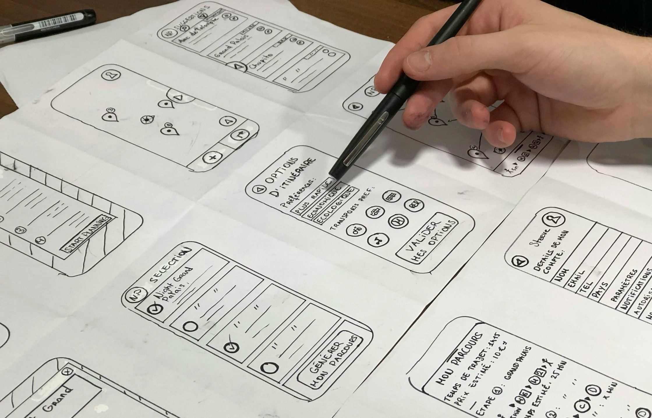
Design Approach
I didn't have the luxury of a formal discovery phase with dedicated researchers — this is a fast-moving government environment where designers wear many hats. Instead, I leaned on a combination of heuristic evaluation, direct feedback from stakeholders (including director-level leadership), and conversations with the operations staff who used the dashboard daily.
My approach focused on three principles:
Surface what matters first. I restructured the page around thematic card groupings — service performance, growth and scanning metrics, and financial indicators — each with their own embedded KPI and trend visualization. This way, a manager could scan the top-level cards and immediately know where to focus.
Keep the depth accessible. The original data table wasn't wrong — it was just the only view. I preserved the full summary metrics table but improved its readability with better typography, color-coded status indicators, and clearer column headers. I also added interactive modal overlays so users could drill into a category without leaving the page.
Design within real constraints. This system serves thousands of users with varying levels of technical comfort. Every design decision had to balance modern usability patterns with familiarity. I worked closely with the development team to ensure what I designed could actually be built within the existing tech stack.
The Solution
The redesigned dashboard introduces a layered information architecture that serves both quick scanning and deep analysis:
-
groups related metrics and tools into scannable categories, each with a header, quick-access links to related reports, and an embedded metric card showing the primary statistic with a trend indicator.
-
replaces the static gauge indicators with mini donut charts and directional arrows that communicate performance trends at a glance.
-
retains the full data depth of the original but with improved typography, a legend, color-coded performance tiers, and better visual separation between metric categories.
-
allow users to drill into any category for expanded context without losing their place on the dashboard.
I built the prototype as a fully functional HTML/CSS/JavaScript implementation to demonstrate interactions and get real feedback from stakeholders before handoff to development.
Check out the live preview of this project here!
What I'd Do Differently
If I had the opportunity to revisit this project with more resources, I would push for formal usability testing with a cross-section of end users before finalizing the layout. The feedback I gathered was valuable but informal — structured testing would have helped validate specific interaction patterns, especially around the modal drill-downs and the balance between the card view and the data table. I'd also explore adding customizable dashboard views so different user roles could prioritize the metrics most relevant to their work.