CASE STUDY 3: Enterprise Analytics Hub Redesign
Role: UI Designer · Client: Federal Logistics Agency · Platform: Internal Web Application · Timeline: OngoingI redesigned a central analytics and reporting hub that housed dozens of tools and dashboards, replacing a cluttered card-grid layout with a structured, category-driven information architecture using filterable sections and expandable tool details.
The Challenge
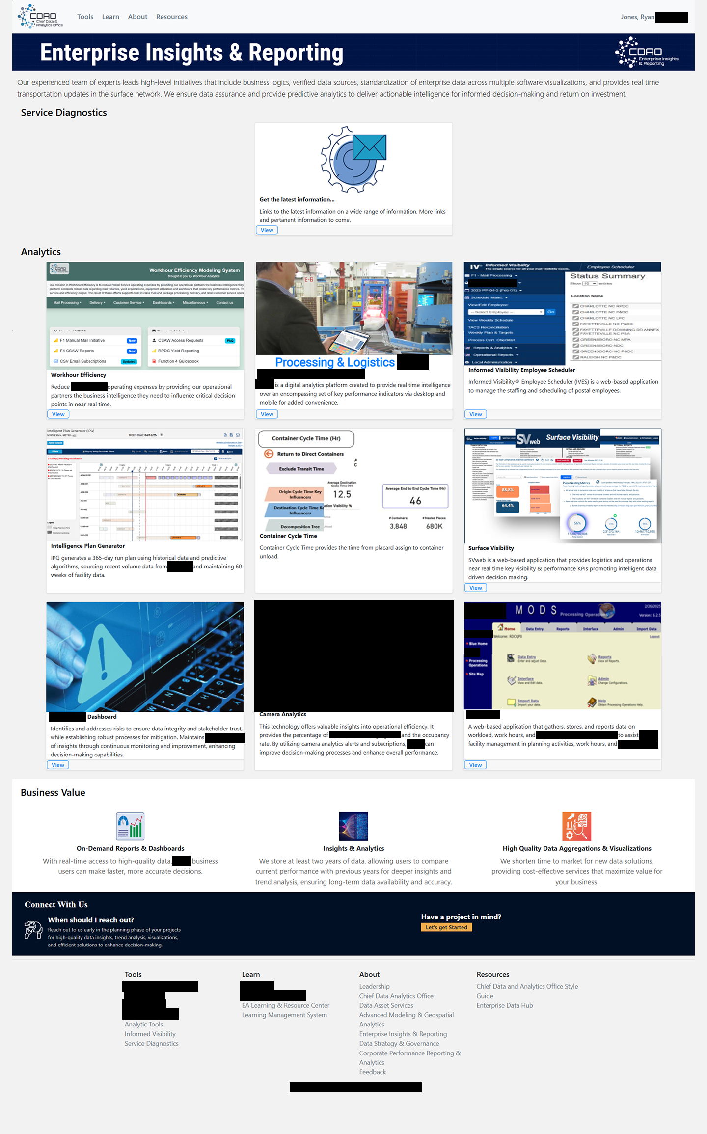
This page served as the front door to the agency's entire analytics ecosystem — over a dozen tools, dashboards, and reporting platforms, each with different purposes, audiences, and levels of complexity. The original design presented everything as a grid of cards, each containing a small screenshot thumbnail, a title, and a brief description.
The approach had two core issues:
No meaningful organization.
Tools were loosely grouped under broad headings like "Analytics" but without a clear taxonomy. A workforce scheduling tool sat next to a logistics visibility dashboard sat next to an election mail tracker — all presented with equal visual weight and no way to filter or browse by category.
Inconsistent information density.
Some cards had detailed descriptions and direct links; others had only a screenshot and a title. The page grew longer over time as new tools were added, but the layout didn't scale — users just got more cards to scroll through.
Leadership wanted the page to feel more professional, organized, and useful as a true starting point for data-driven decision making across the organization.
Design Approach
The first step was creating a proper taxonomy. I reviewed every tool on the page and grouped them into meaningful categories: Analytics & Business Intelligence, Election & Political Mail, Mail & Delivery Visibility, Transportation & Logistics, Visualization & Reporting, and Workforce & Operations Management.
With that structure in place, I designed two complementary navigation patterns:

With that structure in place, I designed two complementary navigation patterns:
A category filter bar near the top of the page lets users quickly narrow the view to a specific domain. This gives experienced users a fast path to their tools without scrolling through everything.
An accordion-based tool directory replaces the flat card grid. Each tool gets a consistent expandable entry with a description, key features, a direct link, and relevant metadata. This standardizes the information density (every tool is presented equally) while keeping the page compact — users only expand what they need.
I also redesigned the page header with a cleaner hero treatment and reorganized the footer and "Connect With Us" sections for better visual hierarchy.
The Solution
The redesigned hub transforms a sprawling grid into a structured, browsable directory:
-
at the top of the page allow users to quickly scope the tool list by domain. The categories are visually distinct with icons, making them scannable.
-
provide a consistent format for each tool: name, category tag, expandable description, key details, and a direct access link. This replaced the inconsistent card thumbnails with a uniform, information-rich layout.
-
at the top gives the most frequently needed resource — service diagnostic links — prominent placement, so power users can get what they need without scrolling.
-
with a clear visual flow: header → diagnostics → category filters → tool directory → business value summary → contact/footer.
The full prototype was built in HTML/CSS with interactive accordion behavior and category filtering, allowing stakeholders to experience the new information architecture firsthand.
Check out the live preview of this project here!
Collaboration & Outcome
This project was driven by a combination of leadership direction and my own assessment of the page's usability gaps. I worked closely with stakeholders to define the category taxonomy — making sure the groupings made sense to the people who actually used these tools, not just from an organizational chart perspective. The redesign was praised by leadership for bringing a level of professionalism and clarity that the page had been lacking, and the category-based structure made it much easier to onboard new team members to the analytics ecosystem.